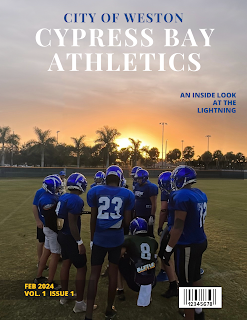
The time has come. Canva is being used today.
Again, I am typing this while I am working on the cover so I am still testing everything out on the template. I put the photo into this template and one thing stuck out at me: the huge lights on the left and right sides of the picture. I opened an app I use to edit photos, Retouch, and did my best to edit them out.
It looks pretty good if I say so myself. Much better than the original where the light posts stood out clear as day. For right now, I am only focusing on the cover page. The template I picked only features the cover so I am going to come up with my own positioning for the table of contents and spread, but that shouldn't be too difficult. Canva is very easy to work with and extremely user friendly, which is why I chose to work with the program.
The original template had a few different fonts throughout the page, but I am keeping Playfair Display as the title and Open Sans Extra Bold as the additional text and the byline. I did bold the Playfair Display lettering to make it show up more on the page.
This is the cover I have for right now, and I honestly really like it. I took the concept I drew out in Cover Ideas post (the second outline) as inspiration for this.The more I look at this cover the more I like it. Bolding the title was definitely the right move because it was difficult to see if it wasn't bolded. I kept the transparent rectangle on the bottom illuminating the date and issue, which makes it stand out more but also is a subtle touch. I matched the blue of "City of Weston" to the text on the right for continuity and to match the jerseys of the players. The yellow of the text on the bottom pairs with the blue as Cypress' colors are blue and gold. Unless I want to make more changes to it, which is absolutely possible, I am going to keep this concept.
Check back later for applying my ideas to the table of contents!


Comments
Post a Comment