Credit Scene & Title
Hey, it's me again. I'm back and starting to think about the details that go into creating a film opening. I really want the title of the film to stand out and be memorable. It seems like the only people who pay a lot of attention towards the credits are people within the film and media industry. Even so, I want to make it perfect and not too over the top. Quality over quantity.
For the credit scene, I want the audience to know who was involved in the making of The Way Up but I don't want it to take away from the action in the film. When I first think of memorable credit scenes, I immediately picture "Raging Bull."
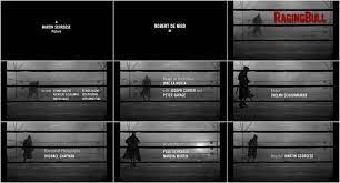
The duration of the opening scene shows a boxer that can be thought of as "caged" by the rink surrounding him. While the audience is drawn into the captivating visuals, Martin Scorsese was able to sneak in the credits without it being distracting. The font matches the theme of the film, as do the colors. The production company title screen and director are in a white font against a black background. This goes perfectly with the following scene of the boxer as it is shot in black and white. The "Raging Bull" title works well in red because, one, it stands out, and two, a bull is drawn to the color red. This makes it fitting towards the audience's eye and goes along with the film name.

For the title, I want to show it right after the scene of me looking out onto the football field. The first shot will be on over the shoulder of me in the car looking out, while the second will feature me running horizontally across the field. "The Way Up" will follow me running, as if I am pulling it behind me. I think this is a creative way to show the title of the film and it incorporates it into the action.


I am leaning towards the last two options, but haven't decided on which to go with. After I choose which font, I will test it out with different colors. When it comes to picking a font color, I am probably going to pick a shade of blue to match the color scheme of the main character. The colors I chose for Oakley involved a mix of blues and grays. To go with this, I could use a blue for the title and gray for the credits.
Well that's it for credits and fonts. We will see how it goes...
Comments
Post a Comment